
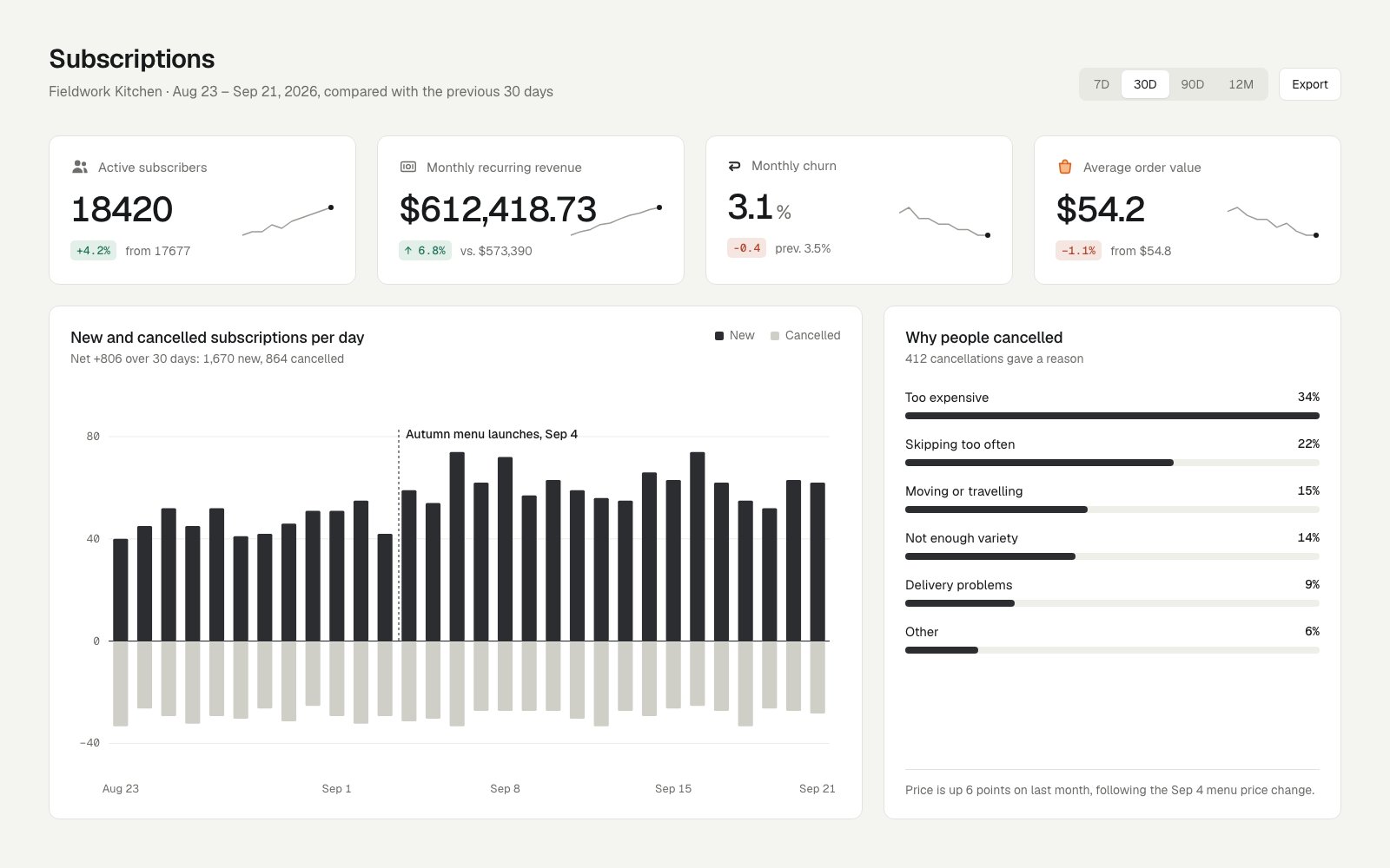
- KPI numbers use four conventions: '18420' with no separator, '$612,418.73' to the cent (long enough to run into its sparkline), '3.1%', and '$54.2' with a dropped trailing zero; the deltas mix '+4.2%', '↑ 6.8%' and a unitless '-0.4'
- Delta chips are colored by direction, not meaning: churn falling 0.4 points (good news) is shown in the same red as the drop in order value
- The bottom row splits about 64/36, so the gutter between the chart and the reasons card lands at x≈993 and lines up with none of the three gutters in the KPI row
- KPI header icons mix a solid filled people icon, a thin 1.5px outline, a heavy 2.5px outline and a two-tone orange bag
Built into this version on purpose, so the judge's read can be checked against a known answer.
Restrained, editorially minded dashboard with real annotations; let down by a sparkline collision, a wrong-color churn delta, and sloppy number formatting.
Craft checks
- ContrastPass. Near-black KPI numerals and bars on white cards read strongly. Secondary gray text like 'from 17677' and the right-panel footnote is light but still legible on white.
- AlignmentFail. In the MRR card, the sparkline starts at ~x657 and runs under the tail of '$612,418.73', which ends ~x687, so the two overlap. The Monthly churn card's label, numeral and delta row also sit ~2-3px higher than in the other three KPI cards.
- SpacingFlag. The 'Why people cancelled' card has a ~130px dead zone between the 'Other' bar and the footnote rule. The bars are pinned to the top rather than distributed to match the chart's height.
- HierarchyPass. Reading order is clear: page title, then KPI numerals, then chart title, then the annotated 'Autumn menu launches, Sep 4' marker, then the reasons list and its causal footnote.
- ConsistencyFail. Delta pills disagree with each other. Only '↑ 6.8%' has an arrow, and '-0.4' drops its unit. The churn pill is red even though churn fell from 3.5% to 3.1%, which is good news. Number formatting also varies: '18420' and '17677' lack commas while '$612,418.73' has them, and '$54.2' should read '$54.20'. The orange bag icon is the only colored icon.
- LegibilityPass. Y-axis ticks (80/40/0/-40), x-axis dates and legend text are small but crisp. The monospace ticks and pills stay readable at the size shown.
Rubric
The grotesk headline and large KPI numerals are confident. The monospace accent for ticks and deltas is a nice touch. However, the small '%' suffix on 3.1 is treated differently from the '$' prefixes, and the formatting is inconsistent.
The warm off-white, ink and stone-gray palette is disciplined, and color is reserved for deltas. That discipline makes the semantic error on the churn pill (red for an improvement) and the stray orange bag icon stand out.
The four-up KPI row and the 2:1 chart/reasons split hold strong outer edges, and the controls align to the right card edge at ~x1543. The reasons card wastes its lower third.
The diverging new/cancelled bar chart is clear. The dotted launch annotation turns data into narrative, and the horizontal reason bars are honest and sorted.
There is a sparkline/number collision in the MRR card. The subtitle says 'Net +806' but active subscribers moved 17677→18420 (+743), so the data contradicts itself. MRR is shown to the cent, which is spurious precision.
Judgment
What works
- The 'Autumn menu launches, Sep 4' annotation plus the footnote 'Price is up 6 points… following the Sep 4 menu price change' creates genuine causal storytelling.
- The diverging ink/stone bar chart shows gains and losses on one axis without any color noise.
- A warm neutral palette with restrained accents gives the dashboard a distinct, non-generic character.
Fix the KPI row as a system. Apply one number format everywhere (thousands separators, $54.20, no cents on MRR). Use one delta pattern (arrow + value + unit) whose color reflects good/bad rather than up/down, so churn -0.4 pts shows green. Shorten the MRR sparkline so it clears the numeral.
Where tasteful people would disagree
Some would call the near-monochrome chart and tiny monospace ticks elegant and editorial. Others would argue the cancelled bars' pale stone gray under-weights the bad news and wants a stronger contrast. Designers would also split on whether the empty lower third of the reasons panel is welcome breathing room or unbalanced dead space.
Judged live by anthropic/claude-opus-5.5 in 30.0s.