
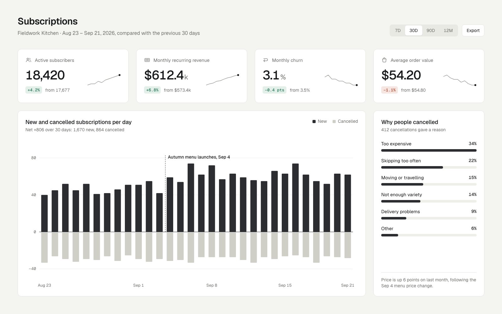
Four KPI cards and two detail cards on one four-column grid, with one number format per unit, one icon style, and green or red meaning good or bad rather than up or down.
Disciplined, story-first dashboard that uses near-monochrome restraint and one annotation to explain the numbers; tighten the dead space.
Craft checks
- ContrastFlag. Body text, bars and headings are strong. The inactive 7D/90D/12M labels in the top-right segmented control and the thin light-gray sparklines are faint against their pale fills.
- AlignmentPass. Page title, subtitle and KPI cards share the ~56px left edge. The Export button's right edge lines up with the Average order value card and the right panel. Card titles and inner content share a consistent ~24px inset.
- SpacingFlag. Card gutters are even, but there are two noticeable dead zones: roughly 80px between the chart subtitle and the 80 gridline, and roughly 110px between the 'Other' bar and the footnote in the 'Why people cancelled' panel.
- HierarchyPass. Reading order is clear: the page title, then large KPI numerals, then the delta badges and 'from' comparisons. Card titles sit above muted subtitles, and the chart annotation 'Autumn menu launches, Sep 4' draws the eye to the key event.
- ConsistencyPass. All cards share one corner radius and a hairline border. Delta badges use the same monospace pill across all four KPIs. Units ('k', '%') are uniformly set smaller and gray beside each numeral.
- LegibilityPass. Y-axis monospace labels (80/40/0/-40) and x-axis dates are small but crisp. Right-panel labels and percentages read cleanly at their size.
Rubric
A grotesk sans paired with monospace for data figures (badges, axis). Scaled-down units on the KPI numerals are a refined touch. The size ladder stays tight at about four steps.
Charcoal and warm stone on off-white carry almost everything. Green and red appear only in the delta badges, and churn's -0.4 pts is correctly shown green, respecting semantics over sign.
The 4-up KPI row over a 3:1 chart/reason split is conventional but well proportioned. It loses points for vertical dead space in both lower cards and for the uneven final x-axis interval (Sep 15 to Sep 21).
The diverging bar chart for new vs. cancelled is the right chart type, and the dashed event marker adds narrative. Sparklines with endpoint dots and small line icons are quiet and consistent.
The footnote insight ties the cancellation reasons to the Sep 4 price change. Comparisons like 'from 17,677' are consistent and the realistic copy is specific. One gap: the annotation says 'menu launches' while the footnote cites a 'price change', a small narrative mismatch.
Judgment
What works
- The diverging new/cancelled bar chart with a single dashed event annotation makes the before/after story legible at a glance.
- Color restraint: semantic color is confined to the delta badges, with direction-correct meaning on churn.
- The 'Why people cancelled' panel closes with a written insight that connects to the main chart, turning data into a conclusion.
Reclaim the dead vertical space: pull the chart's plot area up under its subtitle, then either shorten the reasons panel or fill its gap with a per-reason change vs. last month.
Where tasteful people would disagree
Some would call the near-monochrome palette and gray cancelled bars elegantly quiet; others would argue that cancellations, the problem being investigated, deserve a warmer accent to read as a negative. Similarly, the monospace data font reads as deliberate to some and as a stylistic affectation to others.
Judged live by anthropic/claude-opus-5.5 in 29.6s.