
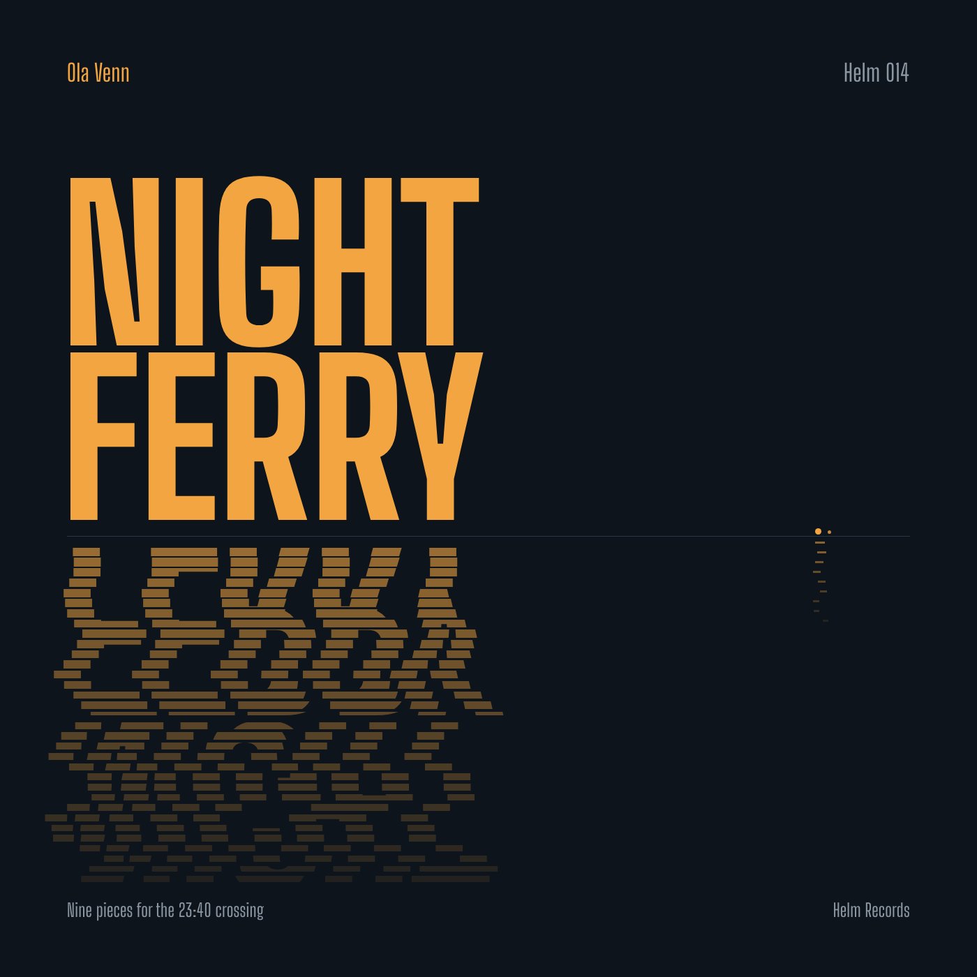
The title is the image: condensed sodium-orange letters above a dark horizon, broken into drifting strips below it like lights reflected on night water.
A single strong idea, type reflected as water, executed with restraint; the reflection gets muddy low down and the tiny boat nearly vanishes.
Craft checks
- ContrastPass. Amber 'NIGHT FERRY' on near-black navy is high contrast. The gray 'Helm 014', 'Nine pieces…' and 'Helm Records' are dimmer but still readable, and the dimming is clearly intentional.
- AlignmentPass. 'Ola Venn', the left edge of the N/F stems, the waterline start and 'Nine pieces…' share the same left margin at ~96px. 'Helm 014', the waterline end and 'Helm Records' share the right margin at ~1304px.
- SpacingFlag. The horizon rule sits only ~22px under the FERRY baseline, while the reflection runs ~490px down to within ~40px of the footer text. The bottom half feels crowded compared with the generous top margin.
- HierarchyPass. Reading order is clear: title, then artist (top-left, amber), then catalog, tagline and label in muted gray at matching small sizes.
- ConsistencyPass. One condensed grotesque family is used throughout. The amber accent is reused only for the artist name and the boat lights at right (~x1172), which ties them together.
- LegibilityFlag. Metadata at ~28px condensed will shrink badly as a streaming thumbnail. 'Helm 014' in gray at thumbnail size will likely disappear. The reflected lettering below ~y1050 dissolves into noise, which is intended but slightly overextended.
Rubric
The tightly tracked, heavy condensed title fills the left two-thirds with authority. The small condensed metadata echoes it. The cramped counters in the G are characterful.
The two-color amber-on-ink palette reads as sodium lights over night water. The reflection fades amber to brown by value rather than hue, which is correct physics and restraint.
The asymmetric block and the empty right field work as open sea. The horizon rule spans the full width, and the boat reflection at far right balances the mass. The reflection is too long relative to the headroom.
The sliced-bar reflection with jittered offsets is a convincing graphic device. The tiny ferry, two dots with a dashed wake, is a witty scale contrast. The lower rows become random-looking and lose the letterforms.
The bar rhythm and fade are careful. However, the bar widths near y1150–1260 read slightly procedural, and the boat lights are so small they risk looking like a stray artifact.
Judgment
What works
- The reflection device turns typography into the whole scene without adding any illustration.
- A disciplined two-margin grid and a two-color palette keep the cover calm and premium.
- The tiny amber boat at the right end of the horizon adds narrative and scale for anyone who looks closer.
Cut the reflection off around y1100 so it fades out earlier, with more dark water before the footer. Then scale up the boat lights and wake about 1.5x so they survive at thumbnail size.
Where tasteful people would disagree
Some would call the water-reflection glitch type a familiar move from ambient and electronic sleeves and want a stranger idea. Others would argue the familiarity is earned by the precise execution and the boat detail. There is also a split over the empty right half: one camp reads it as open sea, the other as unused space.
Judged live by anthropic/claude-opus-5.5 in 20.1s.