
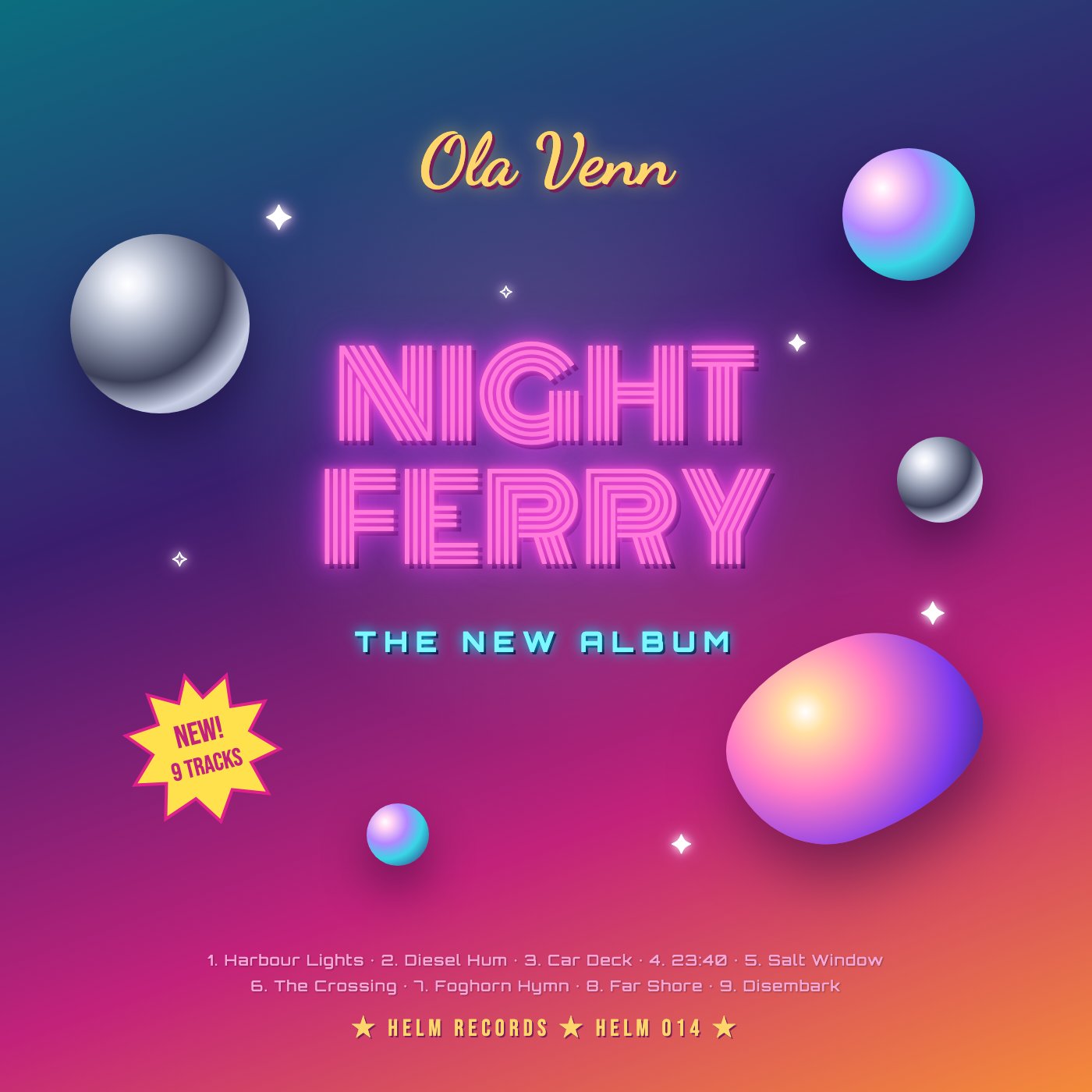
- Glossy fake-3D chrome spheres and an iridescent blob float around the title with no connection to a night ferry or ambient music
- Four unrelated display faces: Monoton for the title, Dancing Script for the artist, Orbitron for the tagline and Bebas Neue on the sticker
- Neon glow on the title, drop shadows on every line of text, and scattered sparkles over a teal-to-magenta-to-orange gradient
- Everything is centered, and the tracklist at the bottom is small pink text over the busy gradient, well below 3:1 contrast in places
Built into this version on purpose, so the judge's read can be checked against a known answer.
A moody title about a night ferry buried under stock gradient, chrome spheres, sparkles, and a supermarket starburst; nothing here evokes water or night.
Craft checks
- ContrastFlag. The two-line tracklist at bottom is light pink at small size over a magenta-to-coral gradient; '6. The Crossing' row is readable but weak. The neon title holds up.
- AlignmentFlag. Everything is center-stacked, while spheres and the 'NEW! 9 TRACKS' starburst at left float on no shared grid. The starburst's tilted edge sits arbitrarily near the lower-left sphere.
- SpacingFlag. There is a large dead gap between 'THE NEW ALBUM' (~y820) and the tracklist (~y1230), and only a tight gap from the tracklist to the HELM RECORDS line. Vertical rhythm is uneven.
- HierarchyPass. 'NIGHT FERRY' clearly dominates. Artist name, subtitle, and credits step down in order.
- ConsistencyFail. Five typefaces compete: yellow brush script 'Ola Venn', inline neon display title, wide cyan techno 'THE NEW ALBUM', rounded geometric tracklist, and condensed Bebas-style credits and starburst. Render styles clash too: matte chrome spheres, iridescent spheres, a glossy blob, and flat stars.
- LegibilityFlag. The multi-line inline strokes of 'NIGHT FERRY' plus the glow will blur at thumbnail size, which is how covers are mostly seen. The tracklist becomes unreadable at streaming sizes.
Rubric
There are five unrelated faces. The script artist name clashes with the 80s inline title, and the wide tracked cyan subtitle adds a third voice. The type also has no ferry or maritime character.
The teal-to-purple-to-magenta-to-orange diagonal gradient is used as personality. Yellow and cyan accents are added on top without a system. 'Night' is contradicted by a sunset-bright bottom right.
The layout is a centered stack with objects scattered around the edges to fill space. The title's credits sit at the very bottom, leaving the middle band empty.
Random 3D spheres and a gradient blob plus four-point sparkles have no relation to ferries, harbours, fog, or night. They are stock filler.
The rendering is technically clean with consistent drop shadows, but the 'NEW! 9 TRACKS' starburst is retail-promo language that cheapens an album cover.
Judgment
Slop signals
What works
- Clear title dominance: 'NIGHT FERRY' reads first and large.
- The inline neon title treatment is internally well-executed with consistent stroke spacing.
- The track titles themselves are a rich, specific concept waiting to be used.
Strip the spheres, sparkles, starburst, and gradient, and build the cover from one ferry-at-night image or device (a lit deck in fog, a horizon line, a single porthole glow) on a dark navy field, with one or two typefaces.
Where tasteful people would disagree
Some would defend the maximal synthwave pastiche as a deliberate retro genre signal suited to certain electronic markets. Others would argue that even within that genre, this is template kitsch disconnected from the album's melancholy maritime theme.
Judged live by anthropic/claude-opus-5.5 in 20.5s.