
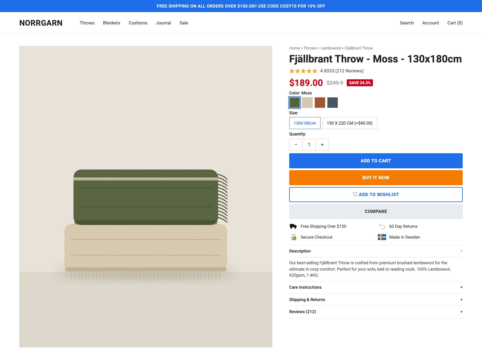
- Four stacked buttons of similar weight (Add to Cart, Buy It Now, Add to Wishlist, Compare) compete for the single purchase action
- Trust-row icons mix four styles: a solid black truck, a thin gray outline return arrow, a lock emoji and a full-color Swedish flag
- Numbers are formatted inconsistently: '$189.00' beside a struck '$249.9', 'SAVE 24.3%', a '4.8333' rating, and sizes written '130x180cm' and '150 X 220 CM'
- Purchase controls are stacked with 6-8px gaps, so swatches, sizes, quantity and buttons crowd together while the image column has room to spare
Built into this version on purpose, so the judge's read can be checked against a known answer.
A calm Scandinavian product drowned in discount-store chrome: four competing CTA colors, raw data formatting, and a brand with no voice.
Craft checks
- ContrastFlag. White text on the orange BUY IT NOW button (#F57C00-ish) sits around 2.9:1, below AA for its size; strikethrough $249.9 in light gray beside red price is also faint.
- AlignmentPass. Breadcrumb, title, price, swatches, buttons and accordion all share a clean left edge at x≈960; logo and image share the 64px left margin.
- SpacingFlag. Label-to-control gaps are tight and uniform (Color/Size/Quantity ~8px), while the four stacked buttons sit only ~6px apart, making the action block feel crammed against the trust icons below.
- HierarchyFail. ADD TO CART (blue), BUY IT NOW (orange), ADD TO WISHLIST (outlined blue) and COMPARE (gray) are all full-width and same height, so four actions compete; red price plus red SAVE badge plus blue banner fight the title.
- ConsistencyFail. Size chips read '130x180cm' vs '150 X 220 CM (+$40.00)'; rating '4.8333' and price '$249.9' are unformatted; trust icons mix a flat black truck, outline return arrow, skeuomorphic gold padlock emoji and a flag.
- LegibilityPass. Roboto-style body copy in the description and 13px breadcrumb are small but readable against white.
Rubric
Single grotesque throughout is fine, but all-caps bold buttons, a shouting banner with '!!', and the SKU-style title 'Fjällbrant Throw - Moss - 130x180cm' give it no warmth or brand.
The product's moss/oat/rust palette is lovely and entirely ignored by the UI, which uses saturated default blue, orange, and sale red that clash with the muted image.
Conventional two-column PDP with a large square image and a well-aligned buy column; sensible, but the right column ends at ~1055px leaving the image to carry dead space.
The flat illustrated folded throws are tasteful and on-palette, but a vector stand-in undersells a tactile wool product that needs photography and texture detail; no thumbnails or gallery.
'4.8333', '$249.9', 'SAVE 24.3%', mixed size-case, padlock emoji and double exclamation marks read as untouched template output.
Judgment
Slop signals
What works
- Clean shared left edge through the entire purchase column
- Color swatches pull directly from the product and read instantly
- Illustration palette (moss, oat, warm stone) is restrained and genuinely Nordic
Collapse to one primary CTA in a deep moss tone drawn from the product, demote wishlist and compare to text links, and drop the orange and red entirely.
Where tasteful people would disagree
Conversion-focused designers would defend the loud Buy Now, sale badge and dense trust row as proven e-commerce patterns; brand designers would argue they cheapen a $189 heritage wool product and that calm, confident pricing sells better at this tier.
Judged live by anthropic/claude-opus-5.5 in 18.5s.