
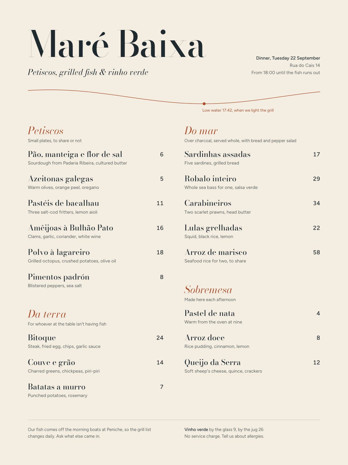
A daily-printed menu built around a tide line: one serif for dishes, one sans for descriptions, whole-number prices on a shared right edge, and a single terracotta accent.
A confident, well-voiced menu with a genuinely clever tide-line device; tighten the section spacing and price alignment and it's reference-grade.
Craft checks
- ContrastPass. Near-black Didone dish names on the warm cream ground read crisply. The gray sans descriptions ('Sourdough from Padaria Ribeira…') are lighter but still comfortable. The small rust caption 'Low water 17:42…' is the weakest pair, yet still legible.
- AlignmentFlag. Left edges hold well at x≈96 and x≈636, and prices hang right in each column. But single-digit prices ('6', '5', '8', '7') sit flush right against double digits, so the left column's price stack looks ragged next to '24' and '14'. The right column's '4' and '8' are the same.
- SpacingFlag. Item rhythm is steady at about 84px per dish. The gaps before 'Da terra' (about 80px) and before 'Sobremesa' (about 90px) are inconsistent, and the right column ends around y=1290 while the left runs to 1370. That leaves an empty pocket under 'Queijo da Serra'.
- HierarchyPass. The reading order is clear. It runs from the giant 'Maré Baixa' masthead, to the italic tagline, to the rust italic section heads, to the Didone dish names, to the gray sans descriptions, to the prices. The date and address block tucks right without competing.
- ConsistencyPass. Every section follows the same pattern: rust italic head, gray one-line intro, then name/description/price rows. The hairline rule in the footer echoes the thin strokes of the wave, and rust appears only on the headings and the tide device.
- LegibilityFlag. The hairline serifs of the display Didone in 'Maré Baixa' and in dish names like 'Amêijoas à Bulhão Pato' will thin out in dim restaurant lighting or on a cheap print. The 13–14px gray descriptions also push the limit for a candlelit table.
Rubric
The high-contrast Didone masthead paired with a clean humanist sans for descriptions is a classic, well-executed pairing. The italic Didone section heads add warmth. The price numerals are sans rather than oldstyle, which reads slightly clinical against the serif names.
The palette is restrained: cream, ink, and a single rust-terracotta accent that evokes brick, paprika and grill. The accent is used sparingly on section heads and the tide line, so it earns its place.
The two-column grid is solid with generous margins. The columns end unevenly, the 'Do mar' column has an awkward gap before 'Sobremesa', and the footer duplicates the two-column split nicely.
The single sine-wave tide line, with a dot marking 'Low water 17:42, when we light the grill', is a smart graphic device. It literalizes the name 'Maré Baixa' (low tide) and ties to the service time. No illustration is needed beyond it.
The copy is specific and charming ('until the fish runs out', 'For whoever at the table isn't having fish'). Diacritics render correctly and there are no orphans. Only minor spacing and numeral-alignment nits remain.
Judgment
What works
- The tide-curve device with its low-water timestamp turns the restaurant name into information, not decoration.
- The copywriting has a real voice and local specificity (Peniche boats, Padaria Ribeira, 'Ask what else came in').
- The disciplined single-accent palette and consistent section structure make the menu easy to scan.
Balance the columns by moving 'Sobremesa' to start level with 'Da terra' at y≈1080, and set prices in tabular oldstyle figures so one- and two-digit prices align cleanly.
Where tasteful people would disagree
Some would push the masthead Didone even larger and more fashion-forward. Others would say its hairlines are already too fragile for a working menu and want a sturdier text serif for dish names. The sans descriptions will also split people: some see them as a necessary legibility contrast, others as a modern note undercutting the period elegance.
Judged live by anthropic/claude-opus-5.5 in 21.3s.