
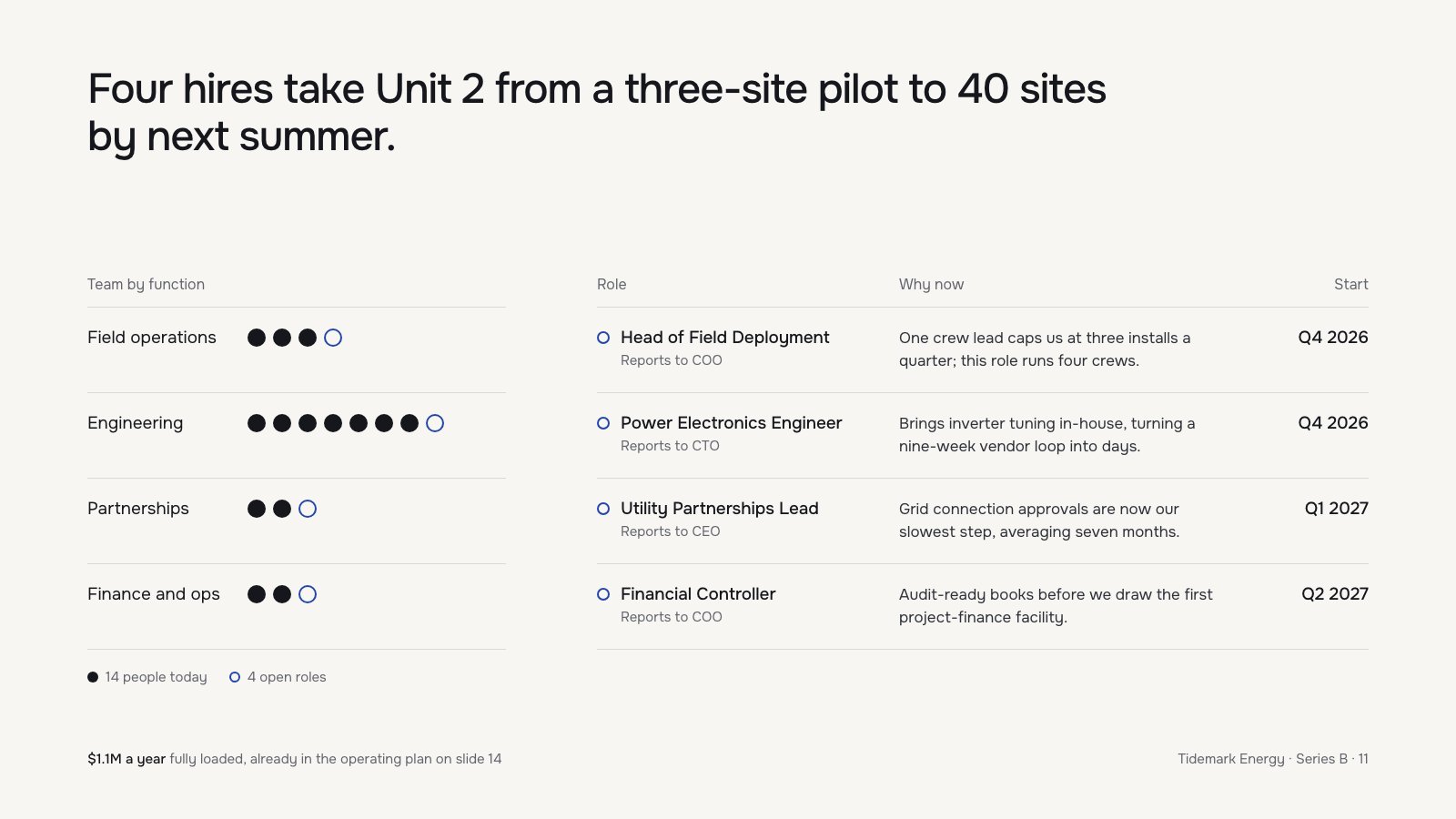
An action title, a dot chart of the team where open seats are hollow blue rings, and a three-column table whose rings, dates and column edges all repeat exactly.
A disciplined hiring slide: an assertion title, honest dot counts, and a why-now column that argues rather than lists.
Craft checks
- ContrastPass. Near-black body text on warm off-white reads cleanly. The gray 'Reports to COO' sublines and the footer 'Tidemark Energy · Series B · 11' are lighter but still clear at their sizes.
- AlignmentPass. The left table's row rules (y≈337, 431, 525, 619, 713) line up exactly with the right table's rules. The title, 'Team by function', and the footer share the x≈96 left edge. The 'Start' dates right-align to the rule end at x≈1504.
- SpacingFlag. There is roughly 130px of dead air between the two-line title and the table headers, compared with about 94px row pitch everywhere else. The dot rows also leave an empty band from x≈490 to 556 in the left table.
- HierarchyPass. The reading order is clear: title, then role names in medium weight, then the why-now text, then gray reporting lines. Start dates in medium weight are easy to scan on the far right.
- ConsistencyPass. The blue open circles mean the same thing in both places, as the open-role dots on the left and the row markers beside each role on the right. Counts reconcile: 3+7+2+2 = 14 filled dots and 4 open, matching the legend.
- LegibilityFlag. The legend ('14 people today') and footer ('$1.1M a year fully loaded…') sit at roughly 14px gray. They will be marginal when projected in a room, and the $1.1M cost line matters to investors.
Rubric
There is one geometric sans in about three sizes and two weights. The title is set tight and large, role names in medium, with no competing styles. The bolded '$1.1M a year' inside the footer sentence is a nice touch.
The palette is a near-monochrome ink on warm paper with a single blue accent reserved strictly for 'open role'. The color carries meaning and does no decoration.
The two tables are row-locked on a shared baseline grid, so the eye can move across the slide in bands. It is slightly bottom-heavy because of the large gap under the title.
The dot-per-person unit chart is simple, countable and truthful, and it shows engineering dominating at a glance. Beyond that it is modest; a sequence or timeline device is absent but not needed.
The counts reconcile and the slide number and cross-reference ('slide 14') are present. Rules are hairline and consistent, and there are no stray radii or effects.
Judgment
What works
- The 'Why now' column ties every hire to a concrete bottleneck, such as 'nine-week vendor loop into days' and 'averaging seven months'. That turns a hiring list into an argument.
- The blue open-circle encoding is used consistently across both tables, so the left chart and right list read as one story.
- The assertion headline states the outcome (3 to 40 sites) rather than labeling the slide 'Hiring Plan'.
Promote the '$1.1M a year fully loaded' line out of the tiny gray footer. Set it at body size near the role table, and use the reclaimed space from the oversized title gap to do it.
Where tasteful people would disagree
Some would argue the left team-by-function chart is redundant and the role table should span the slide at larger size. Others would keep it, because showing the 14-person base makes 4 hires feel proportionate and lean. There is also disagreement on whether 'Unit 2' in the title needs defining for a cold reader.
Judged live by anthropic/claude-opus-5.5 in 22.8s.