
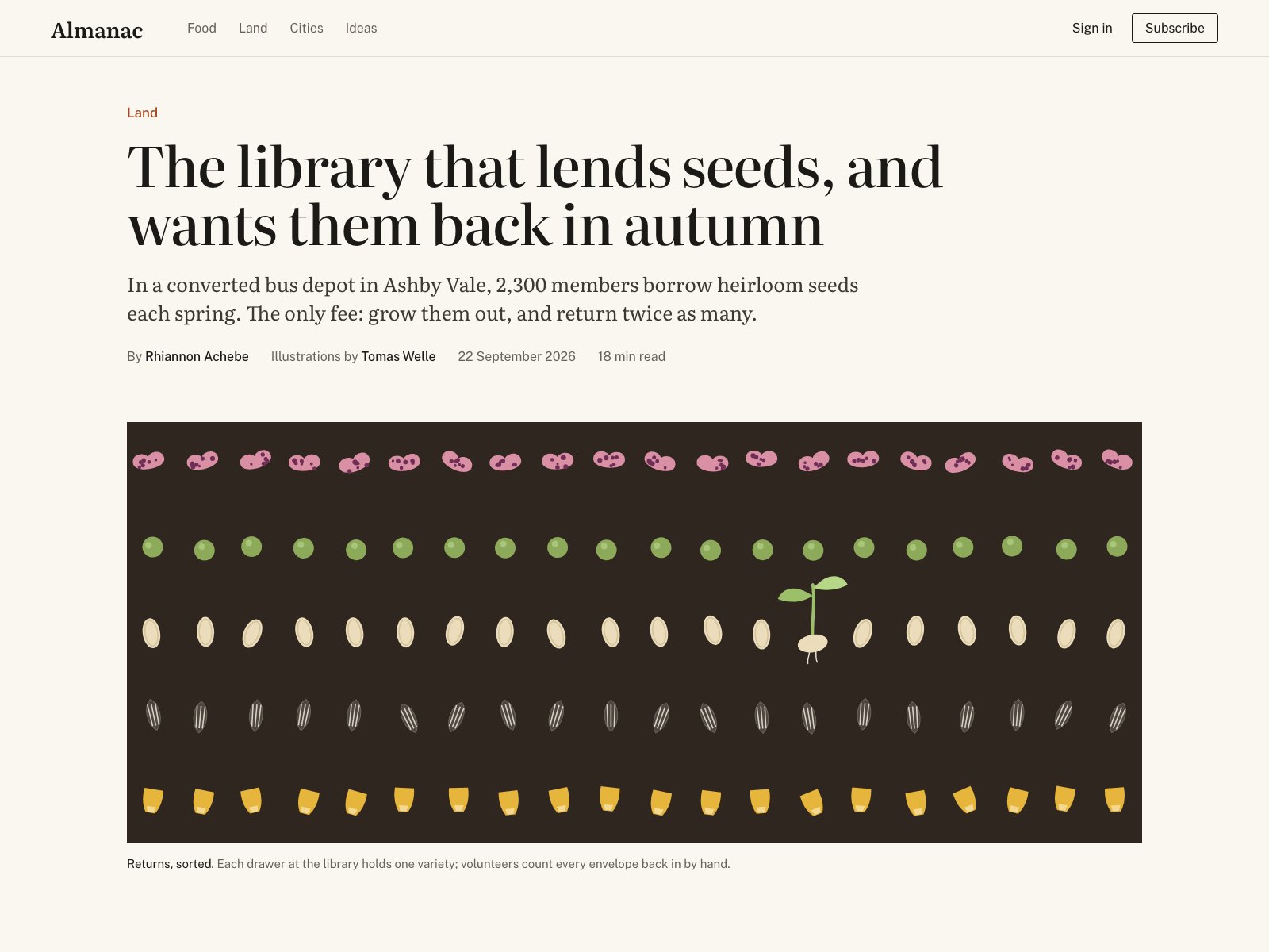
A specific headline and dek on one left edge, a quiet byline, and a commissioned-style illustration of sorted seeds with one sprouting out of place, which is the story in a single image.
A confident, well-edited feature opener: the seed-grid illustration with one sprouting seed is a genuine idea, not decoration.
Craft checks
- ContrastPass. Near-black serif headline on cream is strong; gray byline metadata ('22 September 2026', '18 min read') is lighter but still readable, and pastel seeds read clearly against the dark brown panel.
- AlignmentPass. Kicker 'Land', headline, dek, byline, illustration left edge, and caption all hang on the same x≈160 edge; the illustration extends right to x≈1440, breaking the text measure on purpose.
- SpacingFlag. The gap between byline row and illustration (~70px) is noticeably larger than dek-to-byline (~35px), and the seed rows sit unevenly inside the panel: the top pink row is ~45px from the top edge while the corn row is ~40px from the bottom, with the illustration's right margin tighter than its left.
- HierarchyPass. Clear order: rust kicker → large serif headline → mid serif dek → small sans byline → image → caption with bold lead-in 'Returns, sorted.'
- ConsistencyPass. Sans UI for nav, byline and caption, serif for editorial text; the outlined Subscribe button's square-ish corners match the flat, unrounded illustration panel.
- LegibilityFlag. The caption at bottom left (~14px gray sans) is small for an 1280px-wide image and reads faint relative to the image's visual weight.
Rubric
Tight-set display serif headline with good rag break at 'and / wants'; the dek in a text serif at a comfortable measure; restrained sans for metadata. Headline tracking is slightly tight on 'library that'.
Cream ground, rust kicker, and a dark earthy panel with muted pink, pea green, cream, striped gray, and maize seeds form a coherent harvest palette; the green sprout echoes the pea row.
Classic left-aligned feature opener with generous whitespace; the headline measure is wider than the dek, which is correct. Nothing daring, and the illustration's grid is not perfectly centered in its panel.
Five rows of sorted seeds with slight rotational jitter convey hand-counting; the single germinating seed in row three is a clear focal point that tells the story's premise visually.
Clean nav, consistent edges, a considered caption lead-in; minor rhythm inconsistencies in vertical spacing and the faint caption hold it back.
Judgment
What works
- The sprouting seed breaking the pattern in the third row is a smart, story-specific focal point.
- Strict shared left edge from kicker to caption gives the page firm structure.
- Specific, human copy in the dek and caption ('The only fee: grow them out, and return twice as many') instead of generic filler.
Tighten the vertical rhythm: pull the illustration up to match the dek-to-byline gap and optically center the seed grid inside its panel, then darken the caption body text a step.
Where tasteful people would disagree
Some would call the layout too conventional, wanting the illustration full-bleed or the headline set larger to feel more magazine-like; others would argue the restraint is exactly what lets the illustration's one surprise land.
Judged live by anthropic/claude-opus-5.5 in 18.0s.